
Values
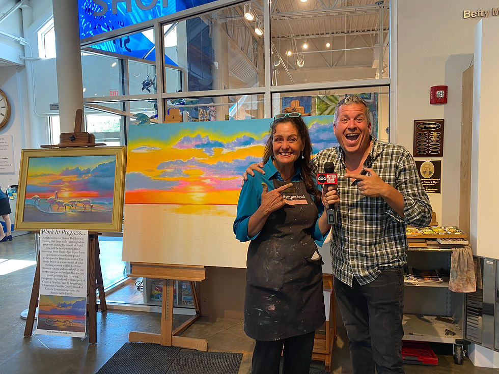
- Shawn Dell Joyce artist

- Apr 27, 2019
- 1 min read
Updated: Aug 16, 2019
Value does all the work but color gets all the credit!
What that means is #VALUE or the subtle shades of dark to light, is what gives a painting or drawing the illusion of realism and dimensionality-not color. We often spend a great deal of time on color, color choices, color theory, but its really value that does all the heavy lifting.
If you can't figure out quite what's wrong with your painting, 90% of the time its values. The other 10% it's probably perspective, but thats another topic! The best way to see the values is to squint your eyes, and stand back from your easel about 6 feet. If the values are good, you can tell immediately.
If they are not, make a value scale of at least 5 values from dark to light using whatever media you are painting in. Hold the scale up to your painting. What's missing? Probably the darkest dark and the lightest light. Most of us make the mistake of using all middle values

and no strong values.
In my classes I stress values and it is the number one concept I teach in all classes, first thing. If you want to learn more, check out my upcoming classes.
Tip:
Do a value sketch #valuesketch before each painting. Helps you determine your lightest light, darkest darks and focal point.
Here’s how to do it:
Make a value scale of 5 values from dark to light #valuescale
lightly sketch the basic shapes of your subject
fill in the appropriate values


Hope to learn a lot on your blog. Thanks for doing this Shawn.
Very helpful. Thanks, Shawn.
Thank you, Shawn. I look forward to folliwing your blog.